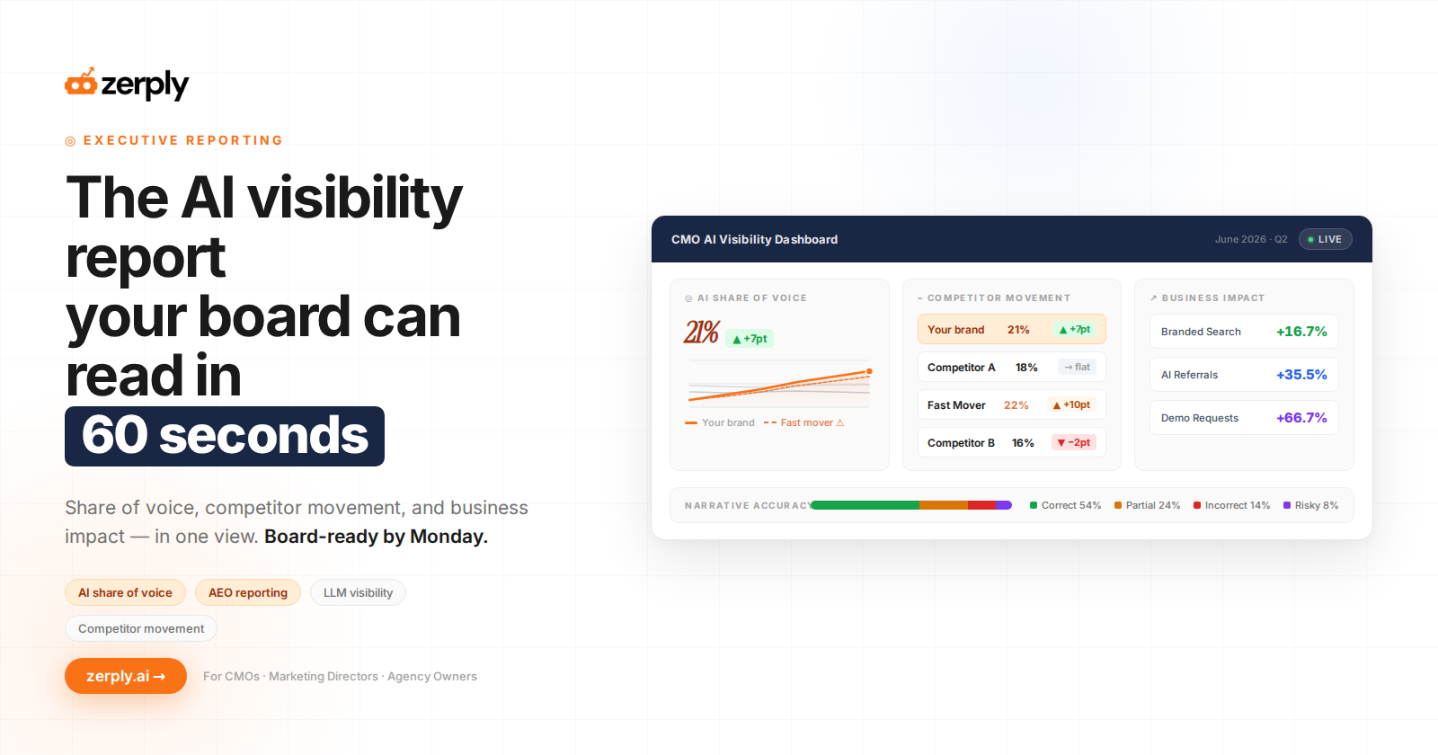
The AI Visibility Dashboard CMOs Actually Need
It’s the quarterly board review, and someone asks the question every CMO now dreads: “Are we showing up when buyers ask AI which vendor to choose?”
You have a visibility score, a screenshot from one model, and a slide that says mentions are “trending up.” Then comes the follow-up: “Up compared to whom? And is it bringing in pipeline?”
Most teams still answer with a vanity score, isolated prompt wins, or screenshots that look impressive but don’t explain competitive position or business impact. That is not an AI visibility dashboard.
It is anecdotal reporting dressed up as strategy.
The urgency is real. G2 reports that around 50% of B2B buyers start vendor research in an AI chatbot, with ChatGPT preferred by 47%. eMarketer and Responsive found that 80% of tech buyers use GenAI at least as much as traditional search for vendor research, while Pew Research shows traditional results get clicked in just 8% of visits with an AI summary versus 15% without.
The CMO-level requirement is simple: one board-ready view that answers three questions.
Are we visible? Are we winning? Does it move the business?
Why Most AI Visibility Dashboards Fail CMOs
Most current AI search reporting and AEO reporting were built for operators, not leadership. They expose prompt-by-prompt fluctuations, but they do not create a narrative a CMO can use in a QBR. That is why so many dashboards feel busy and still fail the executive test.
The first failure is context.
A single LLM visibility dashboard score rarely tells you whether the brand is outperforming competitors, improving over time, or just getting occasional mentions on low-value prompts. Boards do not fund isolated wins. They fund durable advantage.
The second failure is business distance.
AI visibility tracking often lives in one tool, referrals sit in GA4, branded demand sits in GSC, and the competitive story lives somewhere else. By the time you combine it manually, the reporting is late, fragile, and hard to defend.
The third failure is that most tools treat AI like rank tracking.
That does not work. AI answers are probabilistic, platform-specific, and highly sensitive to prompt framing. What leadership needs instead is a governed reporting layer with trend lines, competitor movement, and an explicit recommendation attached to each observation.
What An Executive AI Visibility Dashboard Actually Needs
An executive dashboard should reduce complexity, not mirror it.
That means fewer metrics, tighter definitions, and clear decision logic. I call this framework The CMO AI Visibility Dashboard, or the board view.
The framework: The CMO AI Visibility Dashboard
The board view is built around a small set of strategic KPIs. Each one needs a trend, competitor context, and a downstream business signal.
Just as important, every metric should answer one follow-up question: what decision should this trigger?
The illustrative Northbeam methodology
To make this concrete, I will use Northbeam, an illustrative mid-market B2B SaaS company.
Northbeam is tracked against three illustrative competitors across a fixed panel of 50 prompts on ChatGPT, Claude, Gemini, and Perplexity.
That fixed panel is important because it creates consistency, makes share shifts interpretable, and stops teams from overreacting to one screenshot. In practice, trends matter more than one-off outputs because model behavior varies.
What belongs on the board view
For most teams, five blocks are enough:
- AI Share of Voice
- Citation and Mention Rate
- Competitor Movement
- Narrative and Sentiment Accuracy
- and Business Impact
If a metric does not help explain visibility, competitive position, or business effect, it does not belong on the slide.
Each block should include the same structure: Metric, Formula, Data source, What good looks like, Decision it triggers.
The Five Blocks of the CMO AI Visibility Dashboard
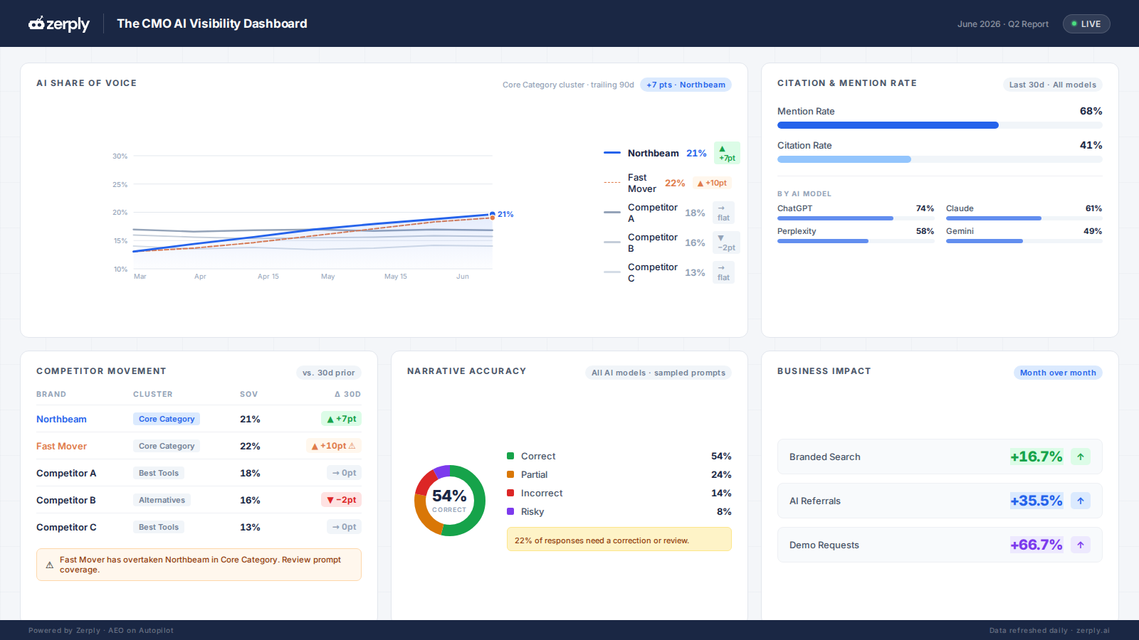
These five blocks turn messy AI search reporting into a board-ready story. Used together, they answer what happened, why it matters, and what to do next.
1. AI Share of Voice
Start with the headline. AI share of voice gives leadership the fastest answer to the question: “Where do we stand?”
But the metric only works if it sits on a fixed prompt panel and a fixed competitor set. If the prompts change every month, the trend becomes noise. If the competitors change every month, the benchmark becomes meaningless.
| Field | Dashboard definition |
|---|---|
| Metric | AI Share of Voice |
| Formula | Brand mentions or citations ÷ total brand mentions or citations across Northbeam + selected competitors in the fixed prompt panel |
| Data source | Prompt-level answer captures across ChatGPT, Claude, Gemini, and Perplexity |
| What good looks like | Quarter-over-quarter growth, especially on commercial, category, comparison, and “best tool” prompts |
| Decision it triggers | Increase investment in prompt clusters, source pages, and third-party proof where share is rising fastest |
In our illustrative example, Northbeam grows from 14% to 21% AI share of voice over one quarter. That is a meaningful signal. It means the brand is appearing more often in the AI-generated answers its buyers are likely to see.
But the board view should not stop there.
One rival also overtakes Northbeam on a core category prompt cluster. That means the top-line gain hides a strategic exposure. Northbeam is becoming more visible overall, but it may be losing authority in the prompts that define the category.
That is exactly why AI share of voice belongs in an executive dashboard. It does not just tell leadership whether visibility improved. It shows where the brand is winning, where it is exposed, and where investment should shift next.
2. Citation & Mention Rate
AI visibility has two layers: being named and being trusted.
A mention means the AI answer includes your brand. A citation means the AI answer uses your website, content, or another source as supporting evidence. Both matter, but they do not mean the same thing.
A brand can be mentioned because the model recognizes it. A brand is cited when the answer has a reason to use it as a source.
| Field | Dashboard definition |
|---|---|
| Metric | Citation rate and mention rate |
| Formula | Citation rate = % of prompts where the brand is cited as a source. Mention rate = % of prompts where the brand is named in the answer. |
| Data source | Answer captures plus extracted cited and linked sources |
| What good looks like | Broader inclusion across high-intent prompts and stronger citation consistency across platforms |
| Decision it triggers | Improve sourceable assets, clarify claims, and refresh pages that should be cited but are absent |
In Northbeam’s example, mention rate improves faster than citation rate. That usually means the brand is appearing in more answers, but AI systems are not consistently treating Northbeam’s website as the best supporting source.
The decision is not “celebrate visibility.”
The decision is “build more sourceable pages and tighten the evidence.”
That might mean improving comparison pages, integration documentation, pricing explainers, use-case pages, customer proof, category definitions, and third-party profiles. For AI search, strong content is not just content that ranks. It is content that can be confidently used as evidence inside an answer.
3. Competitor Movement
This is where an executive dashboard becomes actually useful.
A CMO does not just need to know whether the brand appears in AI search. They need to know who is gaining, where the brand is exposed, and which competitors are becoming more visible in the prompts that matter.
| Field | Dashboard definition |
|---|---|
| Metric | Win-loss movement by prompt cluster and platform |
| Formula | Period-over-period change in visibility share against fixed competitors |
| Data source | Monthly reruns using the same prompt panel and competitor set |
| What good looks like | Fewer losses on high-value prompts and earlier detection of rival surges |
| Decision it triggers | Defend exposed categories, shift content and digital PR effort, and investigate why a competitor is surfacing more often |
A simple winners-and-losers table works best here.
| Prompt cluster | Northbeam | Rival A | Rival B | Rival C | Decision |
|---|---|---|---|---|---|
| Core category | -3 pts | +6 pts | -1 pt | -2 pts | Refresh commercial pages and improve source authority |
| Alternatives / comparison | +4 pts | -2 pts | -1 pt | -1 pt | Expand comparison content |
| Best tools list | +2 pts | +1 pt | -2 pts | -1 pt | Strengthen cited proof pages |
This table changes the executive conversation.
If Northbeam only reports its total AI share of voice, the quarter looks positive. But once competitor movement is visible, the real story becomes sharper: Northbeam is improving overall, but Rival A is gaining faster in the core category.
That is a strategic issue, not a reporting detail.
The next step is to inspect the answers where Rival A gained. Which sources are being cited? Which pages are being referenced? Is Rival A showing up because of its own content, third-party reviews, listicles, comparison pages, documentation, or category authority?
A good AI visibility dashboard should not only show that a competitor moved. It should help the team decide where to respond.
4. Narrative & Sentiment Accuracy
More visibility is not always better visibility.
If an AI answer mentions your brand but describes it incorrectly, the brand may be visible in a way that creates confusion or risk. This is especially important for B2B SaaS companies where positioning, integrations, pricing, compliance, and target customer fit all influence buying decisions.
| Field | Dashboard definition |
|---|---|
| Metric | Narrative accuracy rate |
| Formula | % of prompts scored Correct, with Partial, Incorrect, and Risky tracked separately |
| Data source | Human-reviewed answer samples using a standard rubric |
| What good looks like | Higher Correct rates and fewer Incorrect or Risky outputs on comparison and high-intent prompts |
| Decision it triggers | Fix messaging gaps, update comparison pages, improve schema, and strengthen proof on likely cited pages |
Use a practical rubric:
| Score | Meaning |
|---|---|
| Correct | The answer matches the brand’s intended positioning |
| Partial | The answer is mostly right but incomplete or vague |
| Incorrect | The answer places the brand in the wrong category, segment, or use case |
| Risky | The answer includes hallucinated, exaggerated, or compliance-sensitive claims |
In Northbeam’s illustrative dashboard, overall visibility improves, but narrative accuracy dips on comparison prompts. That is the kind of issue a vanity score misses.
If the model mentions Northbeam more often but describes it as an enterprise RPA platform instead of a mid-market workflow automation platform, the dashboard should treat that as a risk, not a win.
The decision is to fix the source of confusion.
That may mean updating product messaging, adding clearer comparison content, improving Organization and software application schema, aligning third-party profiles, and making category language consistent across the site.
In AI search reporting, accuracy is not a simple nice-to-have. It is part of brand governance.
5. Business Impact
This is the block that earns executive attention.
AI visibility should be reported honestly and directionally, but it cannot stop at mentions and citations. Without business impact, an AI visibility dashboard becomes another marketing artifact.
| Field | Dashboard definition |
|---|---|
| Metric | Branded search lift, AI-referral sessions, and AI-influenced pipeline |
| Formula | Branded lift = period-over-period change in branded query demand in Google Search Console. AI referrals = sessions from identifiable AI referrers in GA4. AI-influenced pipeline = CRM opportunities with observable AI-assisted touchpoints where available. |
| Data source | Google Search Console, GA4, and CRM |
| What good looks like | Visibility gains coincide with stronger branded demand, better AI-referral quality, and directional pipeline contribution |
| Decision it triggers | Defend budget, prioritize AI-visible content, and report AI search as an emerging acquisition layer |
The quality signal is strong enough to justify this block. Ahrefs found that AI search drove 12.1% of signups from just 0.5% of traffic in its own data. Semrush reported that the average AI-search visitor was 4.4x more valuable than a traditional organic visitor. A GA4 study across 94 brands also found that ChatGPT referrals converted 31% higher than non-branded organic search.
For Northbeam, the board view would not claim perfect attribution. That would be misleading.
A buyer might discover the brand in ChatGPT, search for it later on Google, visit the site directly, and convert after a sales conversation.
Instead, the dashboard should show the directional pattern: rising AI share of voice, improving AI referrals, and a lift in branded demand that supports continued investment.
That is enough for the board-level conversation.
The goal is not to prove that every dollar of pipeline came from AI search. The goal is to show whether AI visibility is moving in the same direction as demand and whether the marketing team has a credible plan to improve it.
The One-Slide Board View: How To Turn Observations Into Decisions
The board does not need 20 widgets. It needs one slide that can be read in 60 seconds. That is the whole point of The CMO AI Visibility Dashboard.
For Northbeam, the one-slide board view would show the top-line trend, the biggest competitor move, the largest narrative risk, the current business signal, and one recommended executive action. If a metric does not change a decision, cut it.
Observation for Northbeam
| Observation | Decision |
|---|---|
| AI share of voice rose from 14% to 21% | Keep investing in winning prompt clusters and source pages |
| Rival A overtook Northbeam on a core category | Refresh category pages and reinforce source authority |
| Citation rate improved, but source diversity stayed narrow | Expand sourceable assets and supporting content |
| Narrative accuracy dipped on comparison prompts | Review claims, comparison messaging, and cited pages |
| AI referrals are still smaller than search overall but show stronger quality | Keep AI in channel planning and board reporting |
Reporting Cadence, Buyer Criteria, And What This Dashboard Can’t Do Yet
A good dashboard is only useful if the operating model around it is sustainable. That means cadence, ownership, and tooling need to be defined up front.
Cadence and ownership for sustainable AI visibility tracking
Use a monthly board slide and a quarterly deep audit.
Keep roughly 70% of the prompt panel fixed and use the remaining 30% for exploration. Assign one named owner per metric, then bring the board view into the QBR so AI search reporting becomes part of normal planning.
What to demand from AI brand visibility tools
If you are evaluating AI brand visibility tools, AI visibility tracking platforms, or an LLM visibility dashboard, the checklist is simple:
- Multi-LLM coverage across ChatGPT, Claude, Gemini, and Perplexity
- Fixed prompt panels for trend consistency
- Competitor AI share of voice dashboard
- Citation and source tracking
- GSC and GA4 integration
- Exportable executive views
- Prompt and answer-level explainability
This is where unified workflow matters. Fragmented reporting creates tool fatigue and weakens trust in the numbers. Teams that want a single system for AI visibility tracking should prioritize consolidation over another standalone monitor.
What this dashboard can’t do yet
There are real limits here. AI attribution is still incomplete, some AI-assisted visits still appear as Direct or blended traffic, and LLM outputs vary by run and by platform. AI is better treated as a discovery layer than a perfectly isolated channel.
That does not invalidate the board view. It just means you report with caveats, focus on trends, and resist false precision.
Final thoughts: Report AI Like a Real Channel
Buyer behavior has already shifted.
AI now influences discovery, comparison, and vendor consideration, and the traffic quality signals are strong enough to deserve executive reporting.
The mistake is not under-measuring a trend. It is waiting for perfect attribution while competitors shape the narrative first.
The winning move is to stop chasing screenshots and start running The CMO AI Visibility Dashboard.
If you want that board view to assemble from AI visibility tracking, GSC, and GA4 in one workflow, you can explore Zerply’s AI visibility tracking and pricing with a 7-day free trial.
FAQ
What is AI share of voice?
AI share of voice is your brand’s share of mentions or citations across a fixed prompt panel and competitor set. It is the best headline metric for showing relative visibility in AI answers.
How is an AI visibility dashboard different from SEO reporting or an LLM visibility dashboard?
SEO reporting tracks rankings, clicks, and traffic. An AI visibility dashboard tracks answer-layer inclusion, citations, narrative quality, competitor movement, and business signals across multiple AI systems.
How often should CMOs report AI visibility?
Monthly for the board view, quarterly for deeper audits. That cadence is frequent enough to catch shifts without overreacting to normal model variance.

Founder at Zerply.ai & Wittypen
Anshul is the founder of Zerply.ai and previously built Wittypen, a content marketplace powering SEO growth for 1,000+ businesses. Over the last decade he has worked hands-on with B2B SaaS and tech teams to turn search data into compounding organic growth. At Zerply he shares practical playbooks on AEO, AI visibility, and modern SEO that come directly from experiments, wins, and failures in real projects.